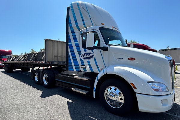
Arhaus Furniture’s mixture of cool, classic simplicity and eye-catching product promotion leads the winners in this year’s National Private Truck Council/CCJ Commercial Fleet Graphics Awards.
Some award-winning fleet graphics feature bold splashes of color and imagery; others are simple and sleek. Some graphics stress brand image, while others promote product. But rarely are fleet graphics simultaneously simple and splashy, both brand-oriented and product-focused. Arhaus Furniture, a furniture retailer based in the Cleveland area, has accomplished all these objectives, and its efforts earned it recognition as the top overall entry in this year’s National Private Truck Council/Commercial Carrier Journal Commercial Fleet Graphics Awards.
Better world, better graphics
Arhaus changed its graphics a year ago after it replaced its old logo. Since the logo change meant new graphics anyway, company officials decided that “we would also like a different view of the Arhaus brand image for the trucks,” says Anne Elshaw, public relations manager for the company. “So we added visual images of some new furniture to make the trucks stand out and show off our products.”
While the trailer slides are simple but striking black with white lettering, the trailer doors are just as stunning in their contrast – a chair sitting in a meadow against a clear blue sky. Otherwise, Arhaus takes a minimalist approach: Just the name Arhaus and its Web address on the doors; and just the name, Web address and phone number on the sides.
In a sense, it’s this lack of information that makes the Arhaus graphics particularly effective. If you visit www.arhaus.com, you quickly discover what Arhaus was trying to say with the intriguing image on the doors. As part of the change in its logo and branding, Arhaus added a tagline – “Furnishing a better world” – to reinforce a green corporate image. Only after going to the website do motorists make the connection, and it’s that kind of follow-through that any marketer craves.
“It was really our focus on making sure our products are eco-friendly,” Elshaw says. “We wanted to show that on our trucks.” She adds that owner John Reed is committed to using only using eco-friendly materials – a value that is a high priority with Arhaus customers.
A nod to trucking
Some of the most effective fleet graphics in some way cleverly play off the fact that the text and images appear on a truck body or trailer. For example, the top-placing Red Gold Tomatoes entry in 2002 featured what appeared to be a partially open roll-up rear door showing cases of tomatoes. Another award-winning entry from the same year from Jack-In-The-Box displayed mouth-watering burgers with the text: “Driver carries no napkins.” And last year, Primo Water placed among the overall winners with graphics featuring the following warning on the back of the trailer: “CAUTION: Following too closely may cause dry mouth, excessive thirst or uncontrollable panting.”